LONG PROVINCIAL
UX Research & Design
Creating a seamless online pickup order
experience for Long Provincial Customers
SCROLL DOWN FOR THE CASE STUDY
SCROLL DOWN FOR THE CASE STUDY
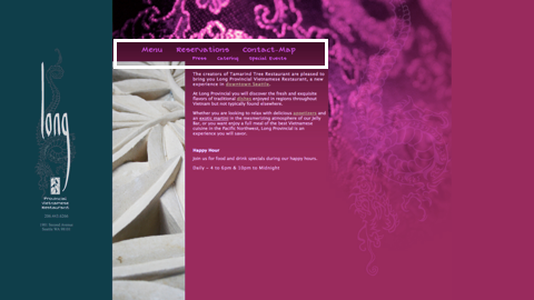
Long Provincial is a Vietnamese restaurant located in the heart of downtown Seattle ran by the same owners of the Tamarind. It has great authentic flavors, and it prides itself as the only restaurant in Seattle that serves gourmet food until midnight.
This project was an individual concept project I did while attending the UX Design Immersive Program at General Assembly, Seattle. I was assigned to select a conceptual client and re-design the website(desktop only) based on the given primary persona. I selected Long Provincial as my client and I focused on bringing convinient online pickup order experience and clear information layout for my target persona.
Competitive analysis, sitemap, wireframes, interactive prototype, and visual mock-ups
July 30th - August 10th
2 Week Design Sprint
Clare Lee
UX Designer
“Users find the current website confusing and nonfunctional because it fails to utilize the convenience of online services such as obtaining information, making reservations, and ordering takouts. I believe better information architecture and efficient reservation and pickup order service will facilitate seamless online to offline experience of using the restaurant. I will know this to be true when the pickup order and reservation revenue increases.”
Long Provincial's main target audience is people in their 20s-40s looking for authentic Vietnamese food in Downtown Seattle. They were not particularly interested in recruiting new customers, but wished to retain the current customers. Also, although the same family who run the Tamarind run Long Provincial, they did not want the brand association, but a more trendy and modern brand image.
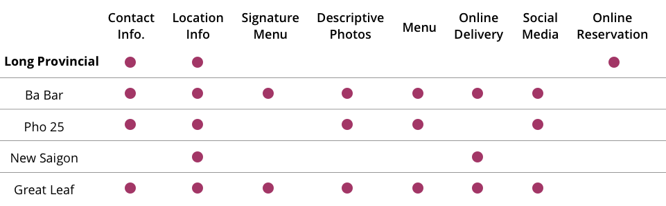
Because Long Provincial’s competitors did not necessarily have a good website – or even have one –, Long Provincial did not see the necessity in having a great online presence. Yet, there are features the competitors’ websites executed well in comparison to Long Provincial's, such as having links to online delivery platforms, good display of signature menu, social media presence, descriptive photos, and better information architecture. However, Long Provincial was the only website that provided online reservation service.
For this project. we were given three personas to choose from, with different backgrounds, tech empathy levels, and age. Because Long Provincial’s has a strong motivation for modern branding, targeting customers in their 20s-40s, I chose the following persona as my primary persona.

Because many of the competitors’ websites linked online delivery or takeout services provided by secondary platforms such as Grubhub or eat24, I conducted additional 5 User interviews to understand the pain points and need for these additional online services. I found out that:
Based on my findings and Lauren’s needs, she will likely use Uber Eats – as Uber is her favorite brand – or other secondary platform services for delivery orders. However, because she is also a type of user who pursues efficiency, I saw the value in addressing the need for including an online pick up order feature in my redesign.
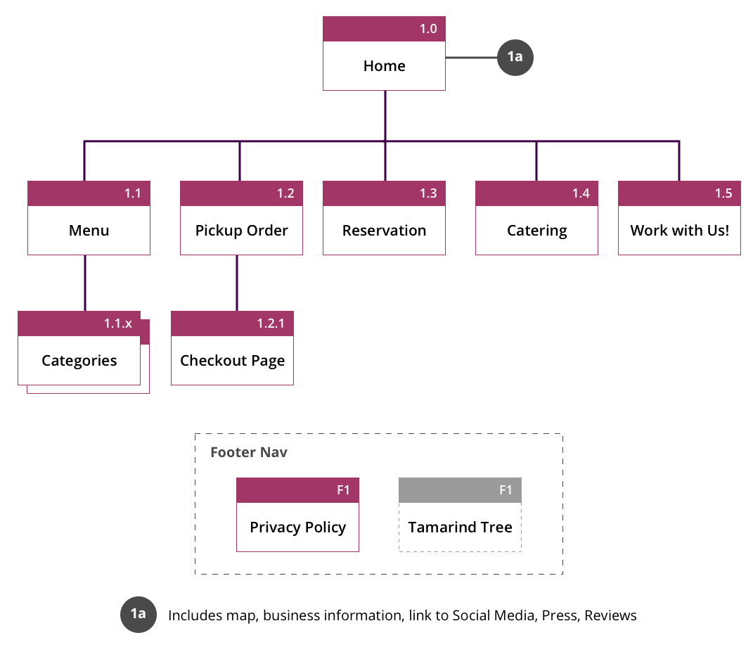
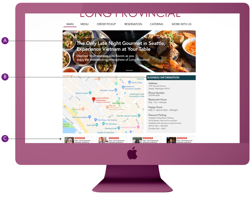
I re-structured the site map so primary information such as contact and map, and publicity information such as reviews can all be displayed on the main page instead of them being separate pages. The re-designed sitemap shows clearer navigation structure where users can access different information from any point of their usage.
I conducted two rounds of usability testing with total 7 participants based on this usability testing script. As I conducted my usability testing, I used this system usability scale to get quantitative feedback from the users. For my first round of iteration, I conducted 4 usability testing with the average score of 66.25. After the second round of iteration I conducted 3 usability testing with the average score of 90.84. A significant increase in usability from the first round of iteration.
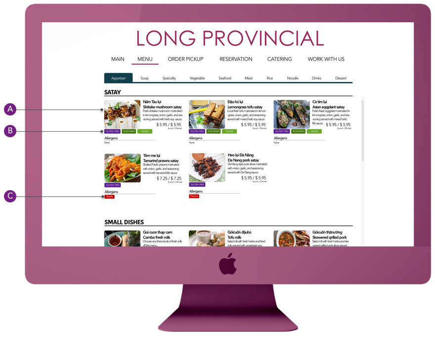
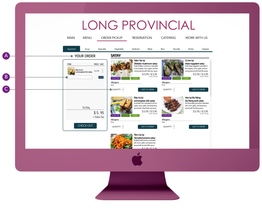
Scenario: Lauren wants to order one shiitake mushroom satay with no cilantro, and one pork satay.
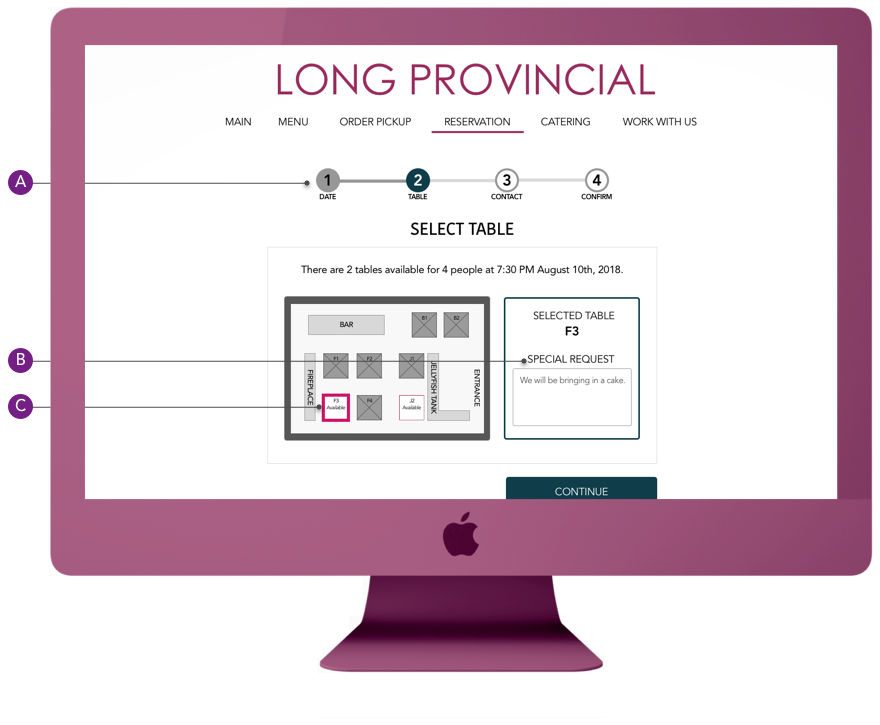
Scenario: Lauren wants to make an online reservation for 4 people for a birthday dinner on August 10th, at 7 pm. She also wants to let the restaurant know that she will be bringing in a cake.
Although, I successfully delivered my project on time with great usability testing results, I wish I had approached my project differently. My project scope was too big in the beginning, trying to make sure I tackled every part of the website. I wish I had strategized my approach with proper feature prioritization techniques, so I had more time to conduct research and testing on features that have the most impact on the users.
My current design had great usability testing results with a clear hierarchical navigation scheme between the pages built based on user interviews. However, I wish I had done more in-person study such as a card sort to tackle the organization of the food menu items.
Because the project focus was desktop, I only designed the desktop version of this website given the time constraint. However, based on my target persona, and the importance of responsive design nowadays, it would have been ideal if I could have built the mobile version first. I would love to work on practicing responsive design.
The next step would be to work on a responsive design of this website so it is mobile-friendly to fully serve the target persona’s needs.
I would like to complete other pages of the website based on more research and usability testing.
BI would like to have a second round of stakeholder interviews for this redesign so I can serve the business needs better.