KEXP
INTERACTION & VISUAL DESIGN
Creating a content rich radio experience
for the KEXP Listeners community
SCROLL DOWN FOR THE CASE STUDY
SCROLL DOWN FOR THE CASE STUDY
KEXP is a nonprofit arts organization serving music lovers and artists through in-person, broadcast, and online programming. KEXP operates one of the most influential listener-supported music radio stations in the world, 90.3 KEXP-FM Seattle, with online and on-air service reaching over 200,000 global listeners each week.
For this project, I focused on interaction design and visual design. I was responsible for creating wireframes and interactive prototype using Sketch and Invision based on our researcher’s findings and usability testing results. I was also in charge of creating the high-fidelity prototype. In addition to my role as a designer, I was also the project manager making sure our project was in focus and on time. In this case study, I will be including a brief summary of our research findings to enhance your understanding of my reasoning behind the different design decisions I made.
Paper prototype, wireframes, interactive prototype, and visual mock-ups
August 13th - August 24th
2 Week Design Sprint
Clare Lee
Interaction & Visual Designer
James Harker
User Researcher & Information Architect
"The KEXP’s iOS application fails to address company's purpose and culture as a “listener-powered non-profit arts organization,” causing inconvenience and disconnect due to inaccessible and dispersed contents and lack of social interactivity. We can serve our users by providing centralized content access and community engagement through the newly designed application."
KEXP is a radio station which thrives on donation and voluntary support from its local community. The station is regarded as an arbiter of musical taste, and draws in listeners across many genre demographics. The station’s listeners are supportive of the local music scene and are exploratory in their music listening. The station also has a large international audience, drawn to the quality programming KEXP provides including in-depth interviews, podcasts, carefully curated playlists, and live performances by underground artists. The KEXP mobile application serves predominantly as a split-attention activity, as most users tune in while commuting and enjoy the convenience of music curation instead of active exploration.
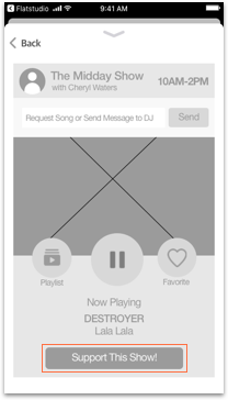
Iteration 1. Users had difficulty locating the favorites button and felt the settings button was unnecessary. Users also felt the navigation scheme confusing and logically inconsistent.
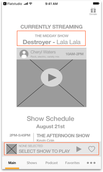
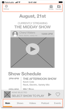
Iteration 2. Users felt the “none-selected” box confusing, and preferred not to be displayed when nothing is playing.
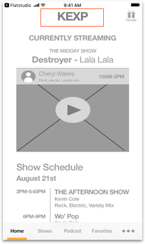
Iteration 3. Users pointed out that we needed more brand presence of KEXP. We decided to enhance the brand by using KEXP's brand color and including its logo and name on the landing page.
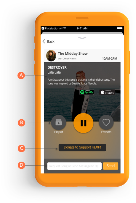
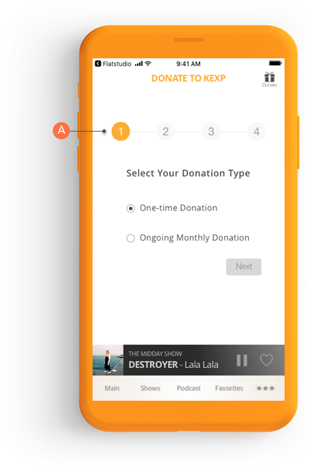
Iteration 1. Users liked how our design had a similar look to apple music and spotify, a music application our target users are commonly exposed to. However, users felt the wording of “support” misleading.
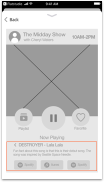
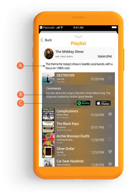
Iteration 2. We wanted to make the song description of the currently playing song easily accessible. However users felt the display location odd, and felt the back arrow to go back to the original layout confusing.
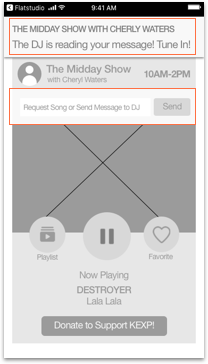
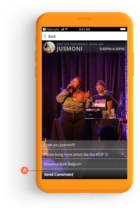
Iteration 3. Users suggested that they would like to make sure they received feedback for their sent messages. We decided to include a push notification when the user’s message is being read. Users also pointed out the “send message” box seems more natural to be located in the bottom.
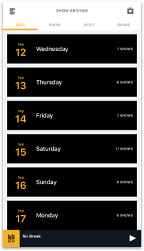
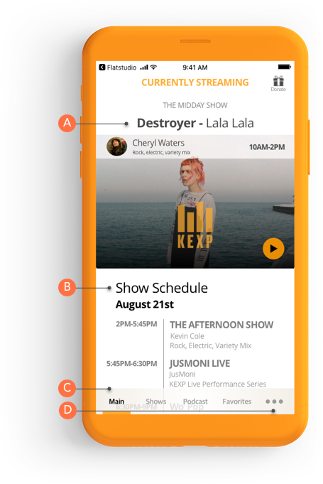
The Current Interface. The current KEXP application archives up to 2 weeks for international listeners and those who missed a show. The current application organizes the show archive with multiple filters such as by DJ, date, and genre, making the current design unnecessarily confusing to navigate.
Sketches. Because our research showed that people kept track of shows by dates, we decided to organize the shows only by date. I explored multiple ways of navigating the shows by date such as a calendar style layout, date picker, and horizontal scroll.
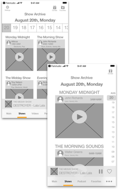
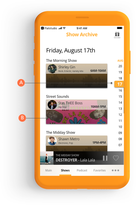
Iteration 1&2. Since shows are only archived for 2 weeks, we decided to have a date scroll bar. Users pointed out that having the scroll bar at the top inconvenient during our first round of testings. Since we wanted to target on-the-go, split-attention users, we decided put the date scroll vertically on the right corner.
During our initial planning process, my teammate and I had very different design strategies. While my teammate focused more on the “farmer” approach, re-designing and polishing the current features, I had a “hunter” approach, adding new features and completely changing the current design. We eventually came to a conclusion that we need a little bit of both for this project and balancing will be the key to success, given the time constraint. I learned that we were able to create a good balance because we consistently communicated our goals for the final design, develop a clear problem statement, and prioritized using multiple feature prioritization techniques.
We had great usability testing results and users loved how we made a clear distinction between split-attention and full-attention users in our navigation bar. However, I wish I had looked into mobile navigation schemes more deeply. We did not fully flush out our “more” button and I would have loved to test different navigation schemes, including a hamburger menu, and different positions for the navigation items.
Although, I made sure I followed the HIG, I realized the importance of developing a consistent UI pattern and design systems as our design’s future step would be to develop the android version. By having a design system, I can have consistent visual language across different platforms. I also noticed we developed different UI patterns for certain features (like donation), and I would like to look more deeply into the different UI patterns we created and their impact on the user experience.
The next step would be to work on other content pages such as podcast, favorite list, and the more section. The “more” section will include video archive, events, and settings. We will need to conduct further research and testing for these pages.
We believe users can set up accounts so their payment information or favorite list can be saved. We also believe incorporating social media plugins such as Facebook for sharing content will increase community engagement. Users can also receive personalized suggestion based on their favorites list.
Because the android application and the iOS application is developed separately, there is discrepancy between the two applications. We would like to apply our design and create the Android version to deliver consistent experience for both platforms.