JOE COFFEE
UX RESEARCH
Creating a work flow optimized mobile order ahead experience for local cafes
SCROLL DOWN FOR THE CASE STUDY
SCROLL DOWN FOR THE CASE STUDY
Joe Coffee is a mobile application platform service that allows local independent coffee shops to accept mobile ordering for customers. Joe Coffee’s mission is to empower the third wave of coffee against the convenience of corporate coffee chains.
For this project, I was responsible for conducting business analysis of Joe Coffee’s competitors, user interviews & field observation for generative user research, and usability testings for each design iteration. I was also in charge of delivering high-fidelity prototype.
User interview guide, research synthesis, persona, usability testing script, comparative analysis, interactive prototype, and visual mock-ups
August 27th - September 14th
3 Week Design Sprint
Clare Lee
UX Researcher
Abduraman Ashoor
Information Architect & Content Strategist
Aaron Hawkins
Interaction Designer & Project Manager
"As baristas, users need a way to effectively communicate with mobile order customers about what’s in stock and how long it will take without disrupting in-store customers because they want to provide a consistent premium experience for all customers. We believe that by creating a work-flow optimized tablet merchant app, we will improve communication between a barista and a mobile customer. We will know this to be true when a barista consistently remains online with a significant increase in coffee shop’s mobile sales."
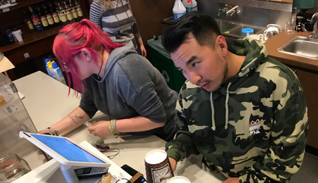
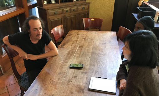
I conducted 8 in-person user interviews and field observations with baristas and managers from Cafe Amore, Pegasus Coffee Bar, and Broadcast Cafe, the launching partners of Joe Coffee in order to understand the general workflow and pain points of cafes. Through these research methods I was able to effectively integrate my team’s design solutions without disrupting the workflow, while tackling the pain points our client has requested my team to focus on.
"We just try to keep a speedy work flow and do our things consistently for the customer and that attracts them on its own"
Because speedy work flow is crucial on the business end, our design solutions focused on efficiency and speediness. We prioritized the different features with minimized steps of interaction and clear information structure that baristas can understand at a glance.
"I remember all the regulars so if I can see them coming in soon through an app like Joe with their name, I can make it all ready for them"
We included special indicator next to a regular customers name – i.e a star – regulars since baristas remember all their drinks, which is another way they manage the drink orders efficiently.
"Right now, customers need to walk in to find out if there is something sold out. I want to make sure they know about these things ahead time"
When it comes to informing the customers, we wanted the application to inform the customers when something is out of stock with simple tap actions instead of typing a full message. We broke down multiple item orders so the barista can only accept orders that are available. When an order is rejected, the application communicates with the server to auto-alert the customers.
"It sucks how some customers walk away when there is a long line because they don't know how fast we handle them. It only takes max 90 seconds to prepare even the most complicated drink on the menu"
Because baristas are confident about preparing the drinks quickly, automatic estimation is an effective way to set the time expectation for the customers. For special cases, we inlcuded a single tap function that increases prep time by minute.
"I would expect the customer to call in 30 minutes before for large quantity orders so we can prepare on time"
The customer-side application should allow the customers to be able to choose when they need something by: ASAP or a certain time. This way if it’s a large quantity, the merchant application can notify the business ahead of time-based on the estimated prep time. These orders can then be populated when it’s time appropriate for the business.

Seth has been the manager and a barista for 8 years at one of the oldest coffee bars in Seattle. His efficient way of working through the orders during rush hour is why his cafe has short waiting time. Once you taste his coffee and charm, you can never go back to Starbucks.
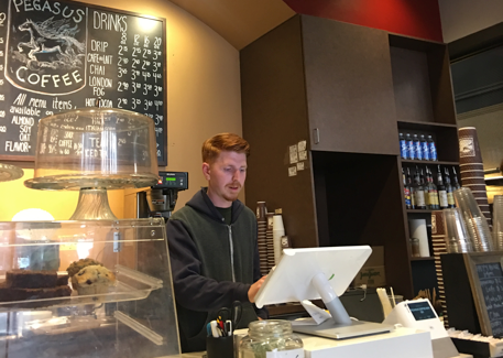
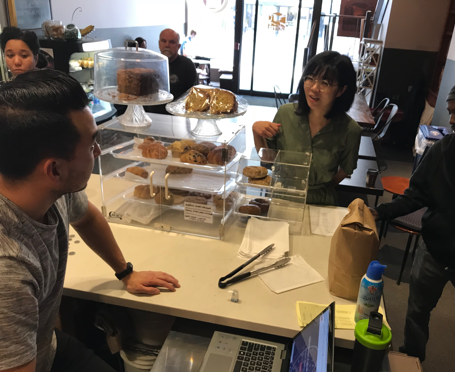
Based on my research findings Aaron, our interaction designer, developed an interactive prototype for usability testing. With our client’s request to focus working closely with the employees at Pegasus Coffee Bar, one of the first launching partners that failed to utilize the previous Joe Coffee application. We conducted 3 rounds of usability testing with four baristas from Pegasus Coffee Bar for each iteration based on this testing script. We also had an in-depth feedback session with the owner regarding the review page, as managers will be the primary user for the page.
Users requested to have an option to alert the customers up to 10 minute delay instead of just 5 minutes during rush hours. We addressed this by including a 3D touch option to turn on the "x2" rush hour.
Users wanted a way to review order history, total sales, and tips per shift instead of the total list for the whole day. Because the review page is primarily used by the managers of the cafe, it was important for the user to understand the information per shift so tips and problems can be evaluated based on the baristas they are managing on each shift.
“Why would the barista ever cancel an order once it’s accepted?” Because every order should be declined if not executable, users found the cancel button unnecessary. The owner of Pegasus Coffee Bar, John, also pointed out that cancel button can promote “lazy behavior” and would not want such option available.
Users wanted order details for each item in the new order list so baristas can make sure a specific flavor or milk alternative is in stock before they accept drink orders. Users also wanted to communicate the reason for decline, so the automated messages can be more personalized.
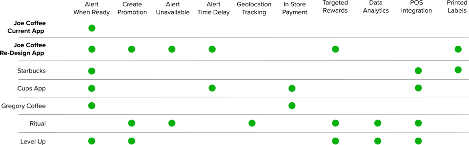
I conducted a comparative analysis of the services provided by Joe Coffee’s primary and secondary competitors. I found out that many services are integrated within the merchant’s order system through POS integration or print receipts (like Starbucks). I also found that many secondary competitors try to serve as a marketing/business analytics tools, providing dashboard and API services. I have observed that while these competitors have great focus on the user experience of customer side applications, the merchant-side applications are very simple, with few functionalities, or dispersed across different platforms (i.e. website dashboard, tablet/mobile application).
Because our client already had a set visual style guide with logo, typography, and brand colors, we did not conduct in-depth research for visual design. However, based on our user input and testing we reinforced visual design components that aligned with our emphasis on efficient communication and at a glance understanding. We used sans-serif font for the labels with font-size no smaller than 16pt for readability. Instead of Joe Coffee's bright red brand color, we used a neutral color palette that is comfortable for the eye.

"With their creative approach to both research and design, they were able to tackle underlying pain points quickly, discover new perspectives and determine innovative solutions for our merchant-side application. One of their prototypes was tested so successfully with our launch clients that we are confident we will be able to integrate their design into our interface in our next releases."
We had the opportunity to work with a highly motivated client, with a clear understanding of the value of UX. However, as the user researcher, I learned that it was important for me to re-emphasize and demonstrate that although some research approaches can be seemingly out-of-focus for the client, it is a necessary step to understand the users so we can tackle the underlying problems and optimize our design solutions.
As I conducted user interviews, I realized how difficult it was to interview people – dealing with the awkward pauses, mistakenly asking dead-end questions, and missing opportunities to learn more. I realized it was very important to build a personal relationship with the participants so they feel comfortable, as they willingly start sharing in-depth details. I wish I had approached some of my earlier interviewees in a more friendly way so I could have gotten the rich story behind their experiences.
Although, we had our font-sizes and button sizes designed based on the HIG, we did not look into accessibility guidelines for our design, especially for visual impairment and color-blindness. I wish we had looked into voice interaction options and inclusive design solutions.
Although our client did not specifically request for visual design work, we wanted to make sure the visual design aligned with our user research findings and enhanced usability. I learned that visual design aspect of a product is extremely hard to get it right. We had great usability testing results, but we would have highly benefited if I could have done some in-person visual design evaluations and compared multiple design variations.
Although we focused on the iOS tablet for this sprint, we realized that our solution will be implemented for Joe Coffee’s web application and android tablets. I learned that it would have been highly beneficial for our client to build a design system for type, color, and spacing, so they can have consistency across multiple platforms.
We can finish the different sections of the review page, by flushing out how the daily customer feedback page would look like. We would also like to include promotion page that allows to now only review past promotions but create new promotions that target specific type of customers (i.e low rating, infrequent visit, declined orders)
Since we have worked on the merchant side application and added additional features to it, a logical next step would be to integrate the additional features into the customer side application, by adding the following features: